

 Don't get lost in the stairway
 Musée des Beaux Arts Rouen


 American


 Rita Phipps ( Ann Sothern) has been waiting for Deborah in front of her home in a neighborhood shared by those on their way up and those on their way down. "Rita is on her way up and wouldn't have it any other way," says the voice of Addie. She rushes back in to say goodbye to the twins, oblivious of her husband, George (Kirk Douglas).
 The beautiful Lora Mae (Linda Darnell) is from a shack on the wrong side of the tracks. It shakes and rattles when the train passes by but Lora Mae stays cool and steady for she knows what she wants...
 and gets it.


 The cumbersome folding screen practically comes tumbling through the viewing screen,

 If you are in love with the worn and faded souvenirs of yesterday and sometimes feel your most at one with humanity when it reaches out to you from the bygone days ... you might enjoy my views of one of my favorite fairs on the Ile des Impressionists.
  Now that I can't get my mind off Screens, it is naturally their direction I pointed my camera.
 It must be difficult to restore some of these.


 Is it worth it to get an old screen or would a new frame be better for this sort of fabric model?
 photo from VOGUE Fée Couture by Michael Thompson robe Dior

 This very simple screen made from a frame with dark green fabric nailed through a ribbon on to it seems to show that the utility of screens had been known for some time already; a screen wasn't only a highly ornamental piece from the Orient. Homemade would do. (Gérhard ter Borch 1665)
 Mme de Rambouillet (1588-1665) is thought to have first brought screens into fashion in France. Their introduction into living quarters coincides with the start of a new desire for privacy in a world where personal isolation was yet unheard of. Interiors were teaming with humanity. Aristocratic circles were surrounded by servants and constant social movement and in simpler home settings, one room served for everything and everybody; living was a collective venture. Folding screens could designate a more intimate space. Behind the protection of its shielding presence, one could listen and dream unseen. (Francois Boucher 1743)
 Vast rooms would begin to be marked off with areas for particular domestic functions. The notion of comfort had started to make headway. Daybeds and low slung fauteuils encouraged a different kind of posture and less self-conscious behavior. One could set off precious chosen company as jewels in front of its richly decorated folds, the better to appreciate glittering banter or stylish readings. Luxury had met with a new sense of douceur de vivre, stiff etiquette could be relaxed here.
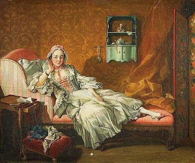
(Jean Francois de Troy 1679-1752)
 With the progression of the home to a personal sanctuary, privacy became more and more natural to the point of being taken for granted. The 19th and 20th centuries saw homes become increasingly the expression of their owner's personalities and this as a prerogative for many.
The use of screens on the stage has long been known as a simple way to change scenery. To those who approach life as an art form, screens seem an especially fitting accessory for the home. You have only to provide the theatrics before the backdrop of your choice. Here's quite an example to follow with Dame Edith Sitwell in this famous photograph by Cecil Beaton. Anna de Noailles, poetess with a flair for exotic costume. Many photographs show her with this screen positioned behind her daybed or her bed.
 It's so much more effective to strike a pose against the vibrant color of a Chinese screen - a method tried and true for us in Western interiors for 400 years. Women's magazines throughout the 19th and beginning of the 20th century were filled with projects for homemade screens using postage stamps, wallpaper, or prints - just as today we may see similar projects using stencils, photographs or storage pockets.
 André Arbus proves the utility of screens even in a very streamlined setting. There are no paintings on the walls but a screen of the same cream tones as the walls sets the accent on the sofa, giving it importance and a level of comfort that it would lack without it.


